
End-to-End UX/UI Design Case Study
Improved Connection in the Motorcycle Community
By: Jaci Moos
Introduction
Comride provides motorcyclists a platform to connect and exchange information within their community. A motorcyclist normally uses a multitude of separate apps, whether it's to communicate with others or to get directions to a meet up point. My goal is to design an app called “Comride'' that integrates multiple functionalities a motorcyclist might use into one app. This end-to-end design is being created by me, Jaci, through a full UX/UI design process.
What to expect:
-
Background
UX Research
Primary Research
Secondary Research
-
Affinity Map
Empathy Map
Persona
Problem Statement
Synthesis Outcomes
-
Solution
User Stories
Sitemap
User flows
Sketches
Guerilla Usability Tests
Low-Fidelity Designs
Wireframes
Edge Cases
Wire flows
Brand Platform
Mood board
Style Guide
High-Fidelity Designs
Accessibility Audit
Prototype
-
Usability Tests First Round
Usability Tests Second Round
-
Lessons Learned
-
Slideshow
Discovery
Background
My husband and I started riding motorcycles in 2020, we quickly began to see there is an entire community with a unique culture. As our interest grew we were unsuccessfully trying to find events or other people to ride with. We became somewhat frustrated to find our niche within the motorcycle world. This was about the same time I started studying UX/UI and decided there has to be a better way to alleviate these difficulties. This became the focus point of my creation with an all inclusive app called “Comride’. Is this a big enough pain point worth pursuing a solution?
Knowing there are motorcycle events in the area with loud pipe sounds rolling down the street, had me wondering if I could have been riding with them. Maybe they knew the best roads or maybe it was an event to help support a non profit foundation. By bringing motorcyclists together it just might create a much more enjoyable experience for everyone. Riders are missing opportunities and experience by not easily finding other similar riders or places to go in a localized area. I’m not even going to mention the hassles of trying to remember which app does what. Do I use this one to chat or do I use the other one for the calendar invite? Which one does what again!? This alone is what I want to simplify. Making it more appealing to all generations.
UX Research
Starting with primary research methodologies such as a screener survey, user interviews and holistic competitor evaluation. These are a few questions I am asking to understand the lifestyle and pain points the users have.
Are motorcyclists interested in further social interaction with each other?
What are their connections with the community currently and what does that look like?
How did they make these connections?
What are they looking for to improve their social experience?
What are some pain points of connecting with other riders?
Primary Research
I am approaching the primary research with three methodologies, a screener survey, user interviews and a heuristic competitor evaluation.
Screener Survey:
First I am posting a screener survey built in google forms on Slack, LinkedIn and Facebook. This will establish social interest in motorcycling, a few other details and will provide contacts and interest to recruit interviewees.
Facebook is providing the majority of feedback as I am able to post my survey to specific “motorcycle” pages and groups to target the appropriate candidates.
I have 114 survey responses in just a few days. Google Forms provided quantitative analytics for me. I am bringing the data into excel to organize the open ended answers using coding techniques and to sort top choices for interviews.
User Interviews:
I’m conducting three semi-structured user interviews with open ended questions that coincide with my research plan to gain qualitative data. I had scheduled six, 50% were no shows. While interviewing I am noticing the discussion script should be shorter and in bulleted/numbered form to help quickly skim the information and still pay full attention to the interviewee.
Competitors Analysis:
To gain insight on the competitor products I am researching two motorcycle apps (Rever, Scenic) and two social media apps (Meetup, Facebook). I want to get an idea what both types of apps have to offer so I can combine the usage. I am looking at UI patterns used for listed information, friends lists and maps. I am taking specific note of customization techniques, visibility and status on the maps while in GPS mode and use of consistency.
Secondary Research Outcomes
Most of the available motorcycle apps do not provide social networking. Some motorcycle groups use Meetup or Facebook, but many of the created groups are inactive. This makes it very frustrating for people to find groups to join.
Categories of motorcyclists can be created by their bike class/type, riding preference or even the motorcycle brand.
Cruisers and Touring bikes are the largest classes
The registered motorcycles have doubled in the last 10 years, therefore the community is growing quickly.
Safety is a top consideration for anything dealing with motorcycles.
Synthesis Methodologies
Affinity Map
While creating an affinity map I separate content with smaller detailed categories, then converge them into groups as I notice similarities. I realize if I were to have a couple more interviews, more insight may become clear allowing me to add separation or groupings to the content.

Empathy Map
The empathy maps are formed by separating what the user says, thinks, does and feels. Additionally I separated content into pains and gains. The data clearly fit best in two personas, the experienced rider and a new rider.

Persona
The empathy map lays the foundation for the personas. It is helpful in determining the focus towards the two focused users. The empathy map easily organizes the data to fill in the details of the persona, giving a more complete vision of the overall user.


Problem Statement
How might we create a platform for motorcyclists to connect within their community and exchange information?
Synthesis Outcomes
Target Users:
Wide age range of 30-59
Interested in social interaction with other riders.
Considers safety highly important.
There are two types of riders to consider (personas)
The experienced rider Is part of an organized group and has information to share about events or groups.
The new rider is looking for events, groups or any new information and wants to connect with other riders
Pain Points:
Unaware of how to connect with other riders if they do not know them personally.
Frustration in tools/apps
Multiple different apps are utilized for specific purposes
Sharing and gaining attendance needed for events is difficult
Sharing and gaining awareness for groups and charity functions is difficult
Finding information such as events, people to ride, groups, routes, etc. is frustrating
Motorcyclists mostly connect by association.
Design and Ideate
Solution
I aim to provide a platform for motorcyclists with a combination of social networking and information sharing in a localized area. This idea is an attempt to combine the users needs into one integrated app.
Inclusions:
Social networking
Groups
Events
GPS / Map
Navigation
Tracking (GPS)
Routes
Searching capabilities
Safety settings in a users profile
User Stories
I used divergent thinking to create the user stories. I’m able to include all the possibilities at this point and then categorize and sort ideas by priority, value and risk converging the results into what I need in the minimum viable product (MVP) for the first essential release.
The insights are giving the product the foundation for what to include. I now have three red routes from my top inclusions.
Idea:
A QR Code could be a swift accessible process to allow users to connect with others on the road.
The user can show or scan a code to add a person, event or group to their profile.
The code can be downloaded for promotional purposes.
Take a picture of the code, save or get directions now to an event
Red Routes:
Connecting with the QR code
Searching for an event and saving it for later
Using the map to provide GPS and get to a point of interest.
Highlight user story:
“As a motorcyclist, I want to quickly connect with another person on the app so that I can reconnect with them later.”
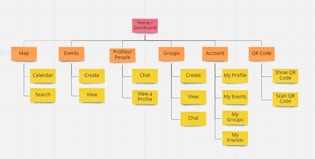
Sitemap
I’ve created the sitemap from the user stories results. On the first round of the sitemap I realized the information architecture was too deep. I re-evaluated the content and simplified the navigation.
First Sitemap:

Second sitemap (re-configured):
UserFlows
The second step I am taking to design the information architecture are the user flows that map out the red routes. These include the decisions and actions the user needs to take. I am reading the user stories while creating these. It's helping to focus on building the navigation rather than thinking of every step at this point. This also helps me to include certain steps I missed in the user stories. The QR code user flow shown below is short and concise, exactly what is needed for its use. The events and map user flows are much more complex due to all the capabilities they include.

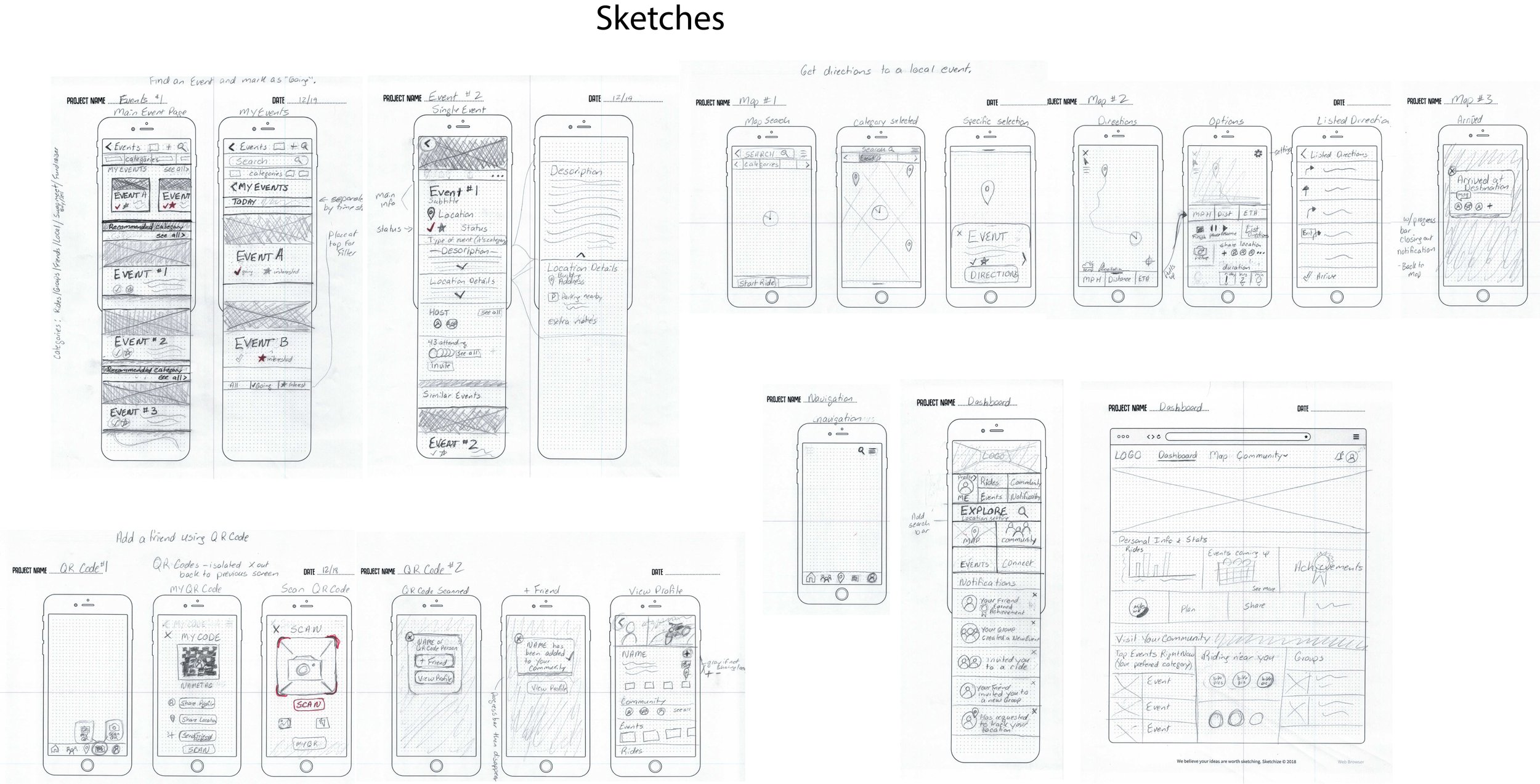
Sketches
I am closely looking at the user flows to sketch the critical screens in the app. This ensures all the interactions I have already brainstormed and analyzed are included.
Guerilla Usability Tests
As I conduct four moderated guerilla studies, my goal is to analyze the basic comprehension of the icons and layout. I scan the images and build a prototype using figma.
Outcomes:
The participants could see the app is for rides, traveling, social networking, and to find things to do.
Confusion occurred with prototype mishaps caused by unlinked pages, my first experience creating and testing a prototype.
Events are not shown as an option on the navigation bar, interrupting the user flow.
A navigation option needed to be added in the maps in order to move about the app.
Recommendations:
Add events to the navigation bar. Add menu option in maps page with navigation options.
Create aspects relating to motorcycles, not just any form of transportation.
Go through the prototype multiple times before testing.
Low-Fidelity Designs
Wireframe Mockups
The low fidelity designs are created from wireframe mockups which visually show the viable screens for the red routes. I am preemptively adding color to these screens to show the call to action (CTA).

Edge Cases
Edge cases were evaluated for:
Offline accessibility options for GPS
Bluetooth connection for QR code while offline
Character spacing for variable fields
Characters limits added to naming convention
names, titles - 50 characters
addresses - 95 characters
Limited information shown on previews. Further details are shown on the details page or by selecting a dropdown option.
Design changes to the layouts are needed to accommodate standard character limits.


Wireflows
The wireflows visualize the exact steps the user would take through the red routes. Allowing me to highlight the CTAs and notice design flaws in the route.

Brand Platform
The brand platform portrays the company's image, ideas and tone. Creating this company is starting with a blank slate, therefore, I am incorporating results from the research results and the problem statement.
Company Name:
ComRide
Conveying the idea of connecting to a community and the comradery motorcycle riders share. “Com” and “Ride” are merged to create ComRide.
Mission/Vision:
We connect like-minded motorcyclists by routing them to their adventures.
Brand Personality:
ComRide is a reliable trusted companion that inspires users to create a fulfilling adventurous life by connecting to their local community.
Brand Attributes:
Inspired by the open-ended question in the screener-survey “Why do you ride?” The top ranking outcomes led to adventure and inspiration. This app is to be a companion for users and a connection to others leading me to add friendship characteristics (reliable, loyal, friendly).
Adventurous
Reliable
Inspiring
Loyal
Friendly
Moodboard
Creating a moodboard generates the look and feel of the brand platform. Accomplished by pulling in imagery, choosing a color palette, and researching UI patterns/elements of the industry standards. This is a good place to include images from the competitor analysis that stood out. Researching color psychology assists the color palette and warm imagery choices.

Style Guide
The style guide includes color, fonts, icons, UI elements, and imagery. This can be used throughout the entire design process to keep design consistency and to stay on brand. The primary color is orange, psychologically representing adventure. The warm tone intrigues excitement. I am only using one basic color to keep the visuals simple and still give a nice pop for the CTAs. A form of black, white and grays with a blue undertone are used for the remainder of the design. The blue undertone contrasts nicely with the orange giving it a pleasing look.

High-Fidelity Designs
Accessibility Audit
The accessibility audit consists of multiple factors which include color contrast, UI states and text fields. By using the Web Content Accessibility Guidelines (WCAG). I'm able to adjust the design to be in compliance. To analyze the color contrast I used the WebAim Color Contrast checker. Adjustments are relayed in an audit report.
The backbone in creating these high-fidelity designs are provided by the brand platform, moodboard, style guide and basic design principles. I started the layout by establishing a grid system, color palette, font styles, and assets. The color palette and font styles are pulled from the style guide and need to be manually imported into the Figma styles. This is important to having a visually consistent color and font theme. I decided on an eight column grid system with 16px gutters for spacing consistency. To mitigate inconsistencies within the multiple screen layouts, assets played an important role. By using components and variables for the assets, it gave me the ability to design multiple screens faster and make changes fluently. Continuous feedback and critique throughout the design process provided an outside perspective.
Design Rationale:
The primary color is orange, the color psychology can represent adventure, excitement, and fun. The warm tone intrigues excitement. The secondary color is dark gray with a blue undertone visually contrasting with the orange, allowing the color to elegantly pop. This dark color is used in the header and navigation. The darker color encompasses a motorcycle dashboard. The colors are lighter in areas that accompany heavy copy and information content.
Orange is a very strong color, therefore it has been used sparingly, mostly for CTA assets.
Corners are kept at a 6 px radius supplying a softer look but not bubbly.
Outlined icons create a clean balanced design and are easier to notice than solid icons.
The orange icon is easy and quick to recognize as active status and captures the user's attention.
Actionable assets are separated from the background by using a slightly darker color. The buttons are outlined with a darker thin stroke to comply with WCAG. The color and stroke differentiation elevates the look of the assets, making them separated and actionable.
Any lists or text heavy areas without a white box are on white backgrounds. This keeps the look clean, allows for easy legibility and accessibility to be at its best.
The map design is altered by moving any non-vital assets into menus to keep the maps as visible as possible.
Prototype
All prototypes for this product are created in Figma. Animations support intuitive transitions.
Informational screens move out from the left and in from the right, following American reading patterns.
Back action is opposite, transitions move out from the right and in from the left.
Map screens transition instantly.
Pop ups fade in and out.
Menus along the side of the screen move in from that direction and move back out when closed.
Validate
Usability Tests Round 1
Moderated remote usability tests were used to validate the first round of high-fidelity designs. I recruited and conducted three interviews with a social media post, sharing details and a link to schedule a meeting with “My Calendly”.
My objectives were to effectively provide a path through the red routes. I’m hoping to understand the users general response to the product. Evaluating places for improvement. I knew the navigation through the events was confusing and hoped to gain insight with the test on improvements.
Tasks:
Find something entertaining to do. Then a way to easily access it again later.
Find something happening near you and how to get there.
Connect with someone you are with right now through the app.
Top Outcomes:
The QR Code functionality was highly praised by all participants.
1. The main map page has a critical drop off error. The hierarchy failed on the screen. Users were confused what step to take and unable to find the category needed in the task. The map icon was not associated with the screen's functions.
Recommendations:
Re-organize the listings in the retractable navigation. In order of categories, recent, then the start ride/record ride. - remove “options”
2. The “QR Code'' is not associated as a tool to connect with other users. Although, navigating to the “QR Code” screen caused excitement and the purpose for the qr code was very clear. The “QR Code” screen opened directly to the camera. During this talk, the first response of all participants was to select “Friends”. At this point there was not a working “Friends” screen. The task had failed.
Recommendations:
Change the “QR Code” label to “Scan” and place the barcode icon lined up in front of the label.
Open to “Scan” for default first impression, then automatically open to camera as an experienced user.
3. The task provided expects the user to navigate through the map for the red route. Initial response of all users was to open “Events”. This action then brought up “My Events” not ALL events causing confusion.
Recommendations:
Change link to show ALL events (instead of My events) when navigating to “Events” from the dashboard and the navigation bar.
Clear up the navigation between the three event pages (my events, all events and starred events). Test a toggle button to switch screens.
Add the search categories that are provided on the map screen on the main events screen.
Adjust the task to prompt the user towards the map.
4. At first impression the user views the “Dashboard”. Here they used the screen to start their navigation instead of using the navigation bar. Once moving through the app the navigation bar was used. The dashboard buttons were not all linked and the “Maps” on the dashboard linked to “Saved Maps” as the map on the navigation bar linked to the main map screen.
Recommendations:
The navigation bar color can be changed to the primary orange.
The buttons on the dashboard should be specified and linked to correct screens.
Differentiate “Saved Maps” from “Maps”
Separate the categories of buttons and add headers
Integrate “Saved Maps” into the map menu and remove it from the dashboard.
Usability Tests Round 2
Using the same methodology, moderated remote usability tests, I interviewed three users for round two. The users were in the mid range of the target audience. Making a multitude of changes from the research synthesis on round one of testing, the prototype and script were iterated and ready for another test.
Tasks:
You are looking for something entertaining to do. Once you find something, save it to easily find it later.
Find a local function happening now and how to get there.
You have just met someone at this event you are attending. As you are standing talking with them, quickly add them to your contacts within the app.
Top Outcomes:
The QR Code appreciation was a prominent highlight in the app.
1. The added toggle button switches only between the “My Events” and “Starred” screens. Helping the viewer notice different sub-screens, but the difference between these two pages disconcerted the users. The “Starred” events label is not clear. The function to return to all events failed as the link on the navigation bar was assumed to be sufficient.
Recommendations:
Create a button to include all events, my events and favorites.
2. To make a connection with someone quickly, two out of three users still attempted selecting “Friends”. The QR code label and icon association is still confusing with the label changed to “Connect”. Even with the misunderstanding of what the QR code can do, the idea and process once on the screen provided commendation and was stated to be “ very innovative”.
Recommendations:
Create a “Friends” screen.
Add a link to the QR Code on the “Friends” screen.
Change the QR code icon to represent connection between people. (possible icon: a user icon with a plus sign/ multiple user icons in a group, a chain link with a user icon)
Add the QR Code function to the marketing plan.
Provide instructional training when first downloading the app.
Make the QR code the CTA on the “Friends” screen.
Since this feature is so popular it could be made more prominently throughout the app.
Conclusion
To bring everything back to full circle, the need to incorporate multiple apps in order to simplify the motorcyclist lifestyle is proven throughout my entire research process. Trying to find balance between all the needs and wants amongst users are obviously different. However, by synthesizing the data I was able to show that “ComRide” would be an effective tool for both experienced and new riders. There were two personas that came to fruition; the experienced riders that wanted a larger based audience and the newer riders that wanted to find more opportunities to ride. These two groups go hand in hand, ComRide is an easy solution to link them together. This can be done quickly using the camera on their phones, to scan each other's QR code to become instant friends. The QR code functionality is intriguing to the user and creates an overwhelming feeling of excitement. I see this as an excellent opportunity to promote ComRide when it’s ready to market.
Lessons Learned
I have learned to design with reasoning and trust in the process and decisions based on research analysis by creating ComRide. As a seasoned graphic designer, this first attempt in using the UX/UI design process rewired my brain.
I’ve gained an appreciation for how each step can flawlessly lead to the next, as long as the insights are utilized. User frustrations in the validation phase derived from not relaying the insights of preceding steps. There were a few changes needed that were already conjured in the sketches, but dropped off in the virtual design process. Moving forward I plan to include all the assets from the sketches or to simplify the wireframes created. As I designed these wireframes, I came up with ideas and changes on the fly.
A large first UX project:
Integrating multiple functionalities into one app is an immense product to tackle while learning each step of the UX process. I would have liked to condense the product for initial release in the user stories when choosing inclusions for the MVP. The final product has a complex architecture with GPS, social media, events, and groups making each step quite extensive. I’ve learned a lot about the complexity and the importance of UX in a multi-functioning product.
Marketing ComRide:
I was surprised by the reaction of the QR code from the usability results. This is a must for the app based on users' reactions. Something that is so simple can be appealing to the audience. This will remind me in future development to never underestimate the little things.
Documentation is essential:
It is essential to document each process step, especially with images through the design process. I did not export the layouts from the first round of usability tests, causing insufficient evidence of the design evolution.
Altered solutions for the first usability test:
I see flaws in the first usability test recommendations. The insight was recorded but not completely understood. The user does not need to be pushed to use the navigation bar by bringing more attention to it. I think the outcome actually shows the users instinct to use the main page for navigation on first impression. The buttons do not need to be separated with headers. They needed to be more clear, concise and link to the correct pages.
Recommendations:
Rename the buttons to be clear and concise. (instead of organizing and labeling button categories)
Write a new task to lead a user through the map. (instead of just adjusting the wording to push the user toward the map.)
Add another task to test the event navigation. (use the original task and retest to see how the changes worked)
Conduct a screener survey for association with a QR code icon.
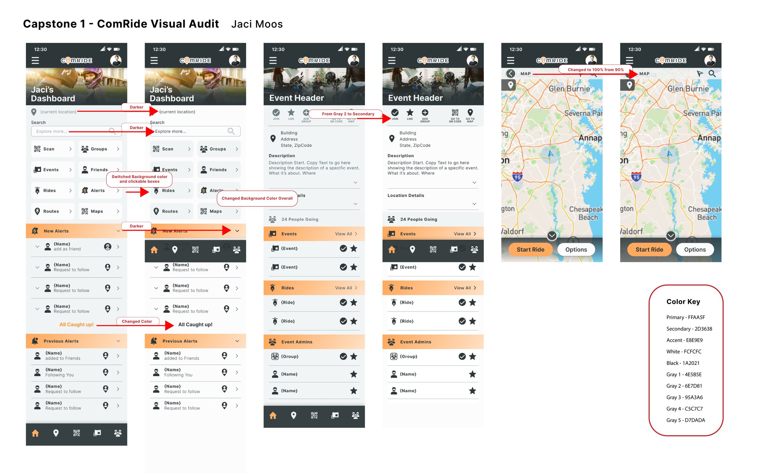
Dashboard Design Evolution:


