
An Agile UX/UI Design Case Study
Adding Messaging and Engagement Solutions to a Fitness App with Generational Focus
By: Jaci Moos
Introduction
MotiVibe Fitness is an app that needs added messaging features and a solution to prolong user engagement. I am approaching this task through agile UX/UI processes and design thinking. Research and testing led to contemporary generational design techniques. During the usability tests I found reasoning to completely overhaul one solution for another. Finally providing a successful design that aligns the company’s goals and the user’s needs and expectations.
What to expect:
-
Write a research plan
Online secondary research
Written research summary
-
Design user flows
Sketching
Wireframes in Figma
Prototype
-
Write test script
Moderated virtual usability tests
Written research report
-
High Fidelity Designs
Prototype
-
Write test script
Moderated virtual usability tests
Written research report
-
Slideshow
Gathering Information and Comprehending the problem
Background:
A well-established company launched a family and friends health app three years ago. The company wants to add group and individual messaging features to prolong engagement and increase usage. Currently the app has the ability to set individual goals, monitor them and display them on a home screen. The app does not provide alerts of any kind or the ability to message others with progress or goal achievements.
Target Users:
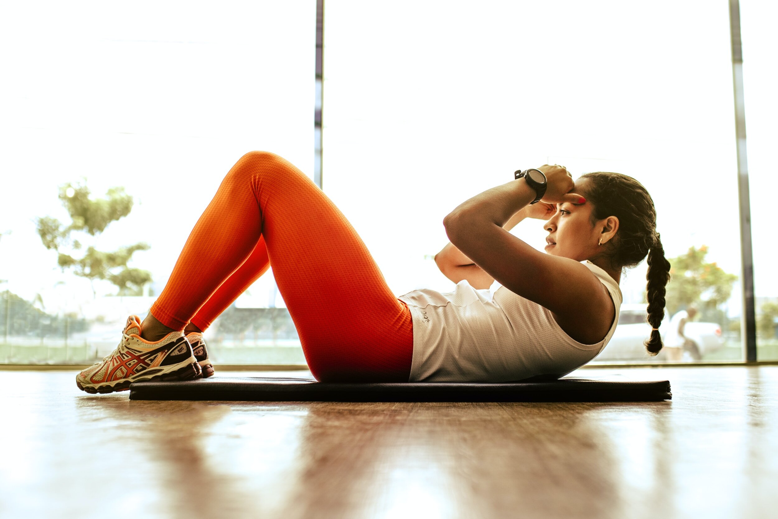
18 - 34 years old (Gen Z and Millennials) Mostly Gen Z as they are the upcoming
Focus on generational design techniques and strategies
Very tech-savvy — they are on their phones for several hours a day
Research the top tech development for fitness apps
Research top apps users are already using
Very budget-conscious
What would cause our product to be overpriced?
How can we accommodate for a low end budget?
Messaging and communicating with friends and family is a very important part of
What are best practiced messenger patterns?
Brand Attributes
Contemporary
Trustworthy
Humorous
Motivational
Company Goals
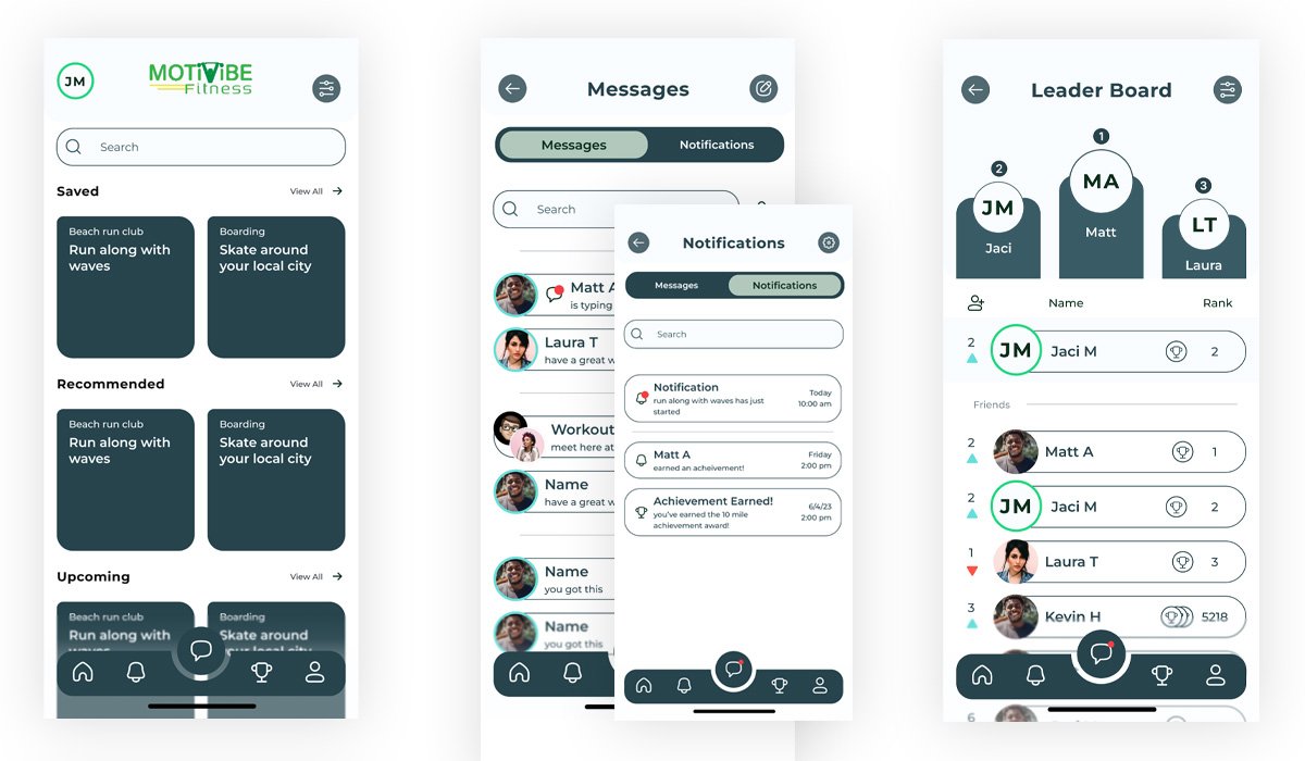
Design new messaging features that create sustained engagement.
Create the opportunity for users to message each other (individuals/groups) with health and fitness goals/achievements.
Provide messaging features extended further than only health and fitness goals.
Create an integrated messaging experience throughout the product that drives engagement and repeat usage.
Competitor Analysis
Keeping the main company goals in mind I am researching top competitors' products. One of the main insights I see is the usage of readily retrievable information used for quick sign in, finding friends and easy sharing capabilities allowing for a more intuitive user experience. Sign in options can connect to multiple pre-created account information such as apple, google, etc. Suggested friends can pull contact info from the phone or social media. Sharing can be done within the app but also externally through email and text. Utilizing and providing these external connections easily can also allow the users to easily promote the product.
Secondly I notice the simplistic nature of the layouts. The color schemes are all contrasting colors of blue and red. “Map My Run” by Under Armor still uses this color scheme for highlights and focus but uses a full contrast of black and white as its main color choices in the layout and action design.
The products that I am analyzing provide references for patterns and design elements that are familiar to users accustomed to popular fitness apps which I will keep in mind while sketching layout design ideas.
Project Planning
The Project Plan:
I am planning an agile UX process by prioritizing which tools and processes to utilize in order to complete the project in a timely manner.
-
Write a research plan
Online secondary research
Written research summary
-
Design user flows
Sketching
Wireframes in Figma
Prototype
-
Write test script
Moderated virtual usability tests
Written research report
-
High Fidelity Designs
Prototype
-
Write test script
Moderated virtual usability tests
Written research report
-
Slideshow
Background:
Research Plan:
The compilation of the research and knowledge on the company, companies goals and competitors will align my research plan.
The goal of this research is to discover more about the target users, messaging patterns and habit patterns. I am listing questions geared towards the brand attributes and UI patterns I need to answer in order to start the design process. I aim to also gain any other insights about the users that could be beneficial.
Questions to answer:
What UI elements and patterns are to be expected?
What are the expectations of our target users in app features?
What apps are most popular now for our target audience?
What engages the user?
What keeps the users interested long term?
What can temp the user back to the app quickly?
What are the users' habits?
What icon type do we use?
What artwork/imagery is popular?
What colors are considered contemporary?
Should we use Dark or Light mode?
What is the general humor and social interaction for the age group?
What strikes the user as fun competition?
Research Summary:
As I start my research I need to see who the users are? I’m researching the user age groups and am realizing that my target audience age group is considered Generation Z (GenZers/Zoomers) and Millennials. This is leading heavily into a generational marketing and design focus.

I’ve decided to focus my design choices with a heavier focus on Gen Z over Millennials. The users lean slightly more toward that of Gen Z. As GenZers are moving in they are proving to be taking over economic influence shown in an article on businessinsider.com.
The “Contemporary” brand attribute gives reasoning to lean into this generational design idea. To keep the app contemporary I want to use this leverage in each of the attributes (trustworthy, humorous, motivational), engagement decisions and design choices. With social media being such an integrated part of this generation's lives and a means of motivation I want to be sure to incorporate easy access to integrate external sharing capabilities through multiple social media platforms and additional external properties such as text and email.

The “Contemporary” brand attribute gives reasoning to lean into this generational design idea. To keep the app contemporary I want to use this leverage in each of the attributes (trustworthy, humorous, motivational), engagement decisions and design choices. With social media being such an integrated part of this generation's lives and a means of motivation I want to be sure to incorporate easy access to integrate external sharing capabilities through multiple social media platforms and additional external properties such as text and email.
Trustworthy
Trust can be earned to this user by designing a product that is familiar, allows customization and provides user-generated content.
An article on sproutsocial.com states “Establishing credibility with the Gen Z audience requires authenticity and transparency. To build trust with this highly skeptical audience, you need to leverage user-generated content.”
Humorous
As this age group has grown up online they have an ironic/pun based humor that makes up a meme culture. This can provide a comfortable social interaction and humor.
Motivational
Social Media
Knowing what they do and say has a purpose and can make a difference.
Zoomers not only appreciate fitness for weight loss, but more importantly for mental wellbeing. To attract these users and sustain their engagement the fitness products should have mental health focuses available. (anxiety, stress management, mindfulness)
Engagement
These users may keep engagement by experiencing the effects of maintaining fitness, building mental fortitude, resilience and a healthier mindset.
Most popular apps:
GenZers: YouTube, Instagram, TikTok, Snapchat
Millennials: Facebook, YouTube, Instagram
Design/Color
Hyper-visual, high contrast, exaggerated imagery - saturation cranked up
Ultra-bright colors, Such as “Gen Z Yellow” and “Gen Z Green”.
Animation, fast-changing images, short videos, a visible point, and vibrant color combinations. Quick and unpredictable.
Clean simple visuals, clear CTAs
tactile, analogous
Brands to become flexible, modular, elements changeable.
Monochromatic logos, Analogous design
Design
I’m starting the design process by laying out flow diagrams to simplify what I can and use as a guide to include the needed actions on each screen.
User Flows:


Sketches & Wireframes:

As I sketch out the screen designs I am referencing the flow diagrams, competitors analysis and researching and best UI practices for icons, layouts, elements, etc. My sketches are very basic with bullet points for inclusions and notes. These quick sketches and notes help me pull together my thoughts while creating the wireframes. I am writing my test script while I design the prototype of the wireframes.
Basic routes to test:
Message a friend.
Share a class with a friend.
Create a group chat and name the group.
Share an achievement.
Receive a message from a friend.
Test reaction to the Leaderboard for prolonged engagement usage
Validate with Usability Tests
Usability Tests First Round:
I am conducting moderated virtual usability studies with 3 users, focusing the questions on the added product attributes.
Question Goals:
Message a friend
Share a class with a friend.
Create a group chat and name the group.
Share an achievement.
Receive a message from a friend to test notifications.
Evaluate reaction to the Leaderboard for prolonged engagement usage.
Overall the tests are showing positive feedback on the added features, but are shedding light on a few problem areas, which is exactly what I’m looking for.
Positive feedback is shown on the general messaging design, a participant states:
“Super easy, very self explanatory, anyone that’s ever used a phone can do it I would think.”
Top Outcomes:
1. In 100% of the first impressions, It is unclear that the list is showcasing fitness “classes”. It is clear that the listed boxes can be selected to show more information. The search is visual and clear and viewed as a secondary means of looking at the classes, this is on target.
Recommendations:
Add logo/name to title bar
Add “Classes” Header
Headers or something showing the type of fitness or activity a class is categorized as.


2. Sharing from the conversation screen in a message was attempted but the action failed. In the conversation screen 100% of participants had difficulty seeing the plus icon to add something to the message. The plus icon was simply not seen by anyone as it does not match the other action icons. The left and right margins do not align down the screen, this is causing the eyes to wander about.
Recommendations:
Make all action buttons consistent in design (dark background with white icon)
Left and Right align all margins
3. Not one participant views the leaderboard as a means to keep their engagement for long-term. 100% of the users show an indifference over the leaderboard. I do not see a reason to continue with leaderboard revisions at this point and feel I should re-evaluate a solution for long term engagement. As I take a look at my secondary research, I realize providing a leaderboard was an assumption to provide competition and prolonged usage. Even though “Gen Z is driven by competition”, it’s not necessarily a main focus point to provide engagement long-term.
Recommendations:
Go back to secondary research and re-evaluate.
A new solution for prolonged engagement
I want to look into the psychology of habit forming. If we can form a habit of returning to the app we will prolong the usage.
I found a couple different models for habit behaviors that are the same in context. The hook model and the four stages of habit.

These both provide 4 steps to creating habits.
Trigger or Cue
Reminder to set goals in notifications
Friends ask to take a class
Phone reminders
Investment or Craving
Set goals
Choose a class
Ask a friend to take a class with you
Action or Response
Working out
Taking a class
Reward
Earn achievements
Share accomplishments with friends on app
Share accomplishments externally on social media
So this covers the basic needs for habit forming, but what could help support building this habit?
By including questions about habits in the beginning icebreakers of the studies, I found keeping schedules and changes in schedules are a huge factor in why fitness habits are broken. I want to provide a solution to keep track of their schedule. A Calendar will help the user visually monitor their progress and goals. Through additional research a calendar is a proven helpful method for habit tracking and providing the user with their information.
As I read in this qualitative study “Most of the participants did not consider the entertainment element critical for adults using health apps.” It explains that the majority of fitness app users like the ability to provide them with information. Self monitoring increases their awareness and setting goals helps discipline themselves and slowly change their behaviors which will prolong usage.


Brand Building and Style Guide
(Backbone of the Layout)
As I dive into the high fidelity design I am changing the overall outlook. I want a color choice that is contemporary “Gen Z”. With my head fully engaged with the brand and the research backing I am deciding to get away from the “norm” of fitness standard colors and a contrasting color palette. I want to use what is known as “Gen Z Green” as a contemporary brand identity. Capturing the users with an unexpected color choice. I am going to keep it monochromatic green to keep the visuals simple and clean. Adding too many bright colors will be distracting and take away from the user experience, especially since I also plan to use motion graphics/icons. I am designing with components and variants in my Figma layout, making changes to attributes throughout the design quick and easy.
Usability Tests Round 2
The second round of tests include 2 participants and questions with the following goals and reasoning.
Have a conversation with a friend.
Share a class with a friend. (Drive engagement - Social media, text messages, sharing classes and leaderboard competition.)
Create a group chat and name the group.
Test reaction to easily add in a friend using “@name” and creating a new group.
Share an achievement.
Share an achievement within a chat.
Notice any insights on the calendar and prompt questions about habit forming and what the user would look for.
Top Outcomes:
Overall the Calendar replacement for the leaderboard has positive feedback. The change resulted in the calendar and profile screens being too similar which is causing confusion. There are also missing elements of the activity feed and friends list.

1. The content of the calendar and profile is repetitive, resulting from the replacement of the calendar for the leaderboard. I still show proof of keeping both pages. Much questioning led to the location of the profile feed and friends list, which should be the focus of the profile page.
Recommendations:
Focus Calendar Screen on stats, achievements and classes within a timeframe
Focus Profile screen on feed, achievements and friends.

2. The “Add icon” on the conversation page is still being overlooked to share an achievement or class. My interviews show proof of this plus sign not signifying a share option. The assumption it could be under that is there but not enough to provide the clickable action.
Recommendations:
Create a new action button to share items and classes via message screen. (share icon)
3. There were major issues creating a group conversation. The usability tests provoked unnecessary frustration by conducting them on a computer for a product intended for a phone. A few simple design defects were able to show through the complication. When selecting the “create message” icon, each user took at least 4-5 seconds to confirm they were on the correct screen. After reviewing, they knew they were correct.
Recommendations:
Add a header to the new message screen “Create Message”.
Make new message icon able to edit the recipients already selected in the current screen
Test the product on a phone.
Both tests show me possible areas to create a more intuitive process by removing steps. With each test I get results for fine tuning and defining alternate paths I have not originally thought of.
Conclusion
In conclusion MotiVibe Fitness is updated with generational design (focusing on Gen Z), research and testing that creates a solution for the company goals and aligns well with the users needs. The leaderboard is replaced with a calendar providing
at this point it is not an essential feature to complete the critical tasks. I am happy with the calendar addition. If I were to continue the agile UX process to keep improving this product here are a few things i would consider:
Keep working towards improving the functionality of the added features while delicately enhancing elements with a contemporary style. I am interested in incorporating more interactive content, animated attributes and exploring the idea of unexpected shapes and patterns that were discovered in the secondary research.
Test the product on the intended device which will provide more accurate and insightful reactions and results. People are programmed to utilize the functions of devices differently, therefore, the second nature of their reactions affected the “usability” study.
For example, providing a placeholder “keyboard” on the phone prototype causes the users to naturally react using the actual computer keyboard. As a result this action changes the screen and process that is being tested.
