

UX/UI Design Sprint Case Study
Budget and Product Suggestion Home Decor Ecommerce Website
By: Jaci Moos
Introduction
House2Home is a new startup ecommerce website with a goal to make decorating homes and apartments on a budget easier while using lower cost accessories and décor items. As a UX / UI Designer, I am approaching this challenge with a modified GV design sprint to quickly test solutions. I am utilizing design thinking methodology, sketching, low fidelity wireframe designs and moderated usability tests. In five days, I quickly move through steps to prove how well a quick brainstorm solution tests with users. The final result is a wireframe prototype. While the ideas are rough and need refinement, the research proves there is intrigue in the base idea and can be worth pursuing.
Walking through the sprint day-by-day
Monday
Understanding and mapping the user experience
The Company Goals and Research
The company has provided survey information, a recorded interview, target user persona, the stakeholder’s goals and some of the company’s input.
Stakeholders Goal:
Make it easier for people to decorate their new homes and apartments on a budget using accessories and decor at costs of $10-$50 / item. House2Home sees a great opportunity to find a “starter kit” of items to instantly decorate their new place.
Target User
Young adult
New house or apartment
On a budget
I am taking notes and evaluating all the data provided. I analyze my notes by creating segments of information into an affinity map created in Figma (FigJam File). Categories start to align as I group the segments together.
Results show the target users know the look and feel they want to achieve with décor, but they need assistance in choosing items to create the maximum impact on a limited budget. Many users are overwhelmed by the purchase and do not follow through. Many users want to see the items in their house. There is a lack of confidence in their own choices.

The problem
How might we provide assistance to users to choose items that decorate their houses/apartments within a limited budget and create the look they desire.
Mapping the consumers experience
In order to understand the process the user will take I am creating an end-to-end experience map. I start with the end result goal and brainstorm backwards through the steps it could take the user to reach that goal. Below are the details showing how to start at the end to find your beginning.
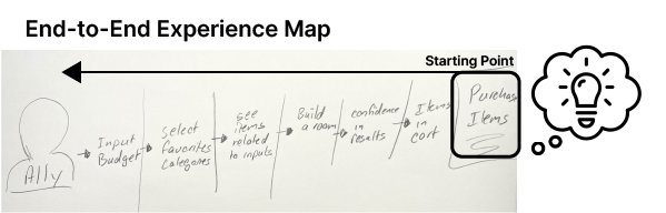
END
1. Purchase Items
Question: What is the final end goal?
Thought: The end goal is to have the user purchase items confidently.
Reasoning: If the customers are not confident in their items they will not purchase. If they do not purchase, the goal of the company has not been accomplished.
2. Finalized view of all items - Shopping Cart
Question: How to get to checkout?
Thought: Add items to a shopping cart.
Reasoning: This is a proven organized pattern in ecommerce.
3. Users' confidence in chosen items
Question: How can they get items into their cart they are confident in?
Thought: Confidence can come with assistance, advice, testimonials, reviews and visual aids.
Reasoning: I evaluated the results with empathy and a psychological thought process. It was very apparent in the multiple answers the consumers were not confident in their own choices. If the reasoning was not so apparent I would have created an empathy map to provide more insight.
4. Build a Room
Question: What would the user build a room with?
Thought: AR (Augmented Reality) is a great visual to provide the user to view items in their personal space, but I am working on a website not an app. So they could build their room with just the items or we could add a photo of their room for a simplified version of AR.
Reasoning: Multiple statements were made from the company's research about wanting to view the items in their space.
5. Choosing items related to the user’s wants
Question: How do they choose the specific items?
Thought: Items can be chosen by individual shopping, advice, suggestions and related items.
Reasoning: 100% of the pain points shown in the affinity map were users not knowing which items to purchase.
6. Selecting options based on what the user wants
Question: How could we narrow the results to specific items the users want?
Thought: Personalization through filters and themes can narrow the results
Reasoning: The research proves the users know what type or style of things they are looking for. This is the main point for the user’s information to connect with the appropriate products.
7. Budget
Question: What else do we need to consider looking at our goal?
Thought: The budget should be a factor incorporated throughout the entire process. I assume most ecommerce sites would prefer to avoid this tactic as it could limit spending. It could potentially have an outcome of less abandoned carts by earning trust and catering to the user’s needs. Within the ecommerce marketing considerations, there could be options throughout to add to the budget and suggest additional items.
Reasoning: The budget is a main factor in the company’s goal and the main constraint for the users to consider.
END at the beginning – The User
Tuesday
From lightning demo to sketches
What can a lightning demo accomplish?
A quick 25 minute secondary research session provides plenty of inspiration for designs and décor for a base solution idea. I am gaining inspiration from images, UI patterns, samples and articles.
Inspiration:
Ecommerce UX Design filters
Virtual Room Designer
Personalization AI - UX / UI enhances
Merchandise spotlight
Articles on confidence in customers
Augmented Reality
Reviews and Tutorials
Progressive elements
Examples: Living Spaces - Categories with options

Ideas to visuals through sketching.
Features inclusion ideas:
Budget feature
Ability to adjust budget.
Keep track of the budget with visuals and written amounts throughout the shopping process.
Add or remove items easily to cart
View shopping cart list on any page
Have suggested items
With the research and goals and these feature inclusions, I am going to use the crazy eights technique by creating eight sketches in eight minutes.

What is the most critical screen?

The most critical screen in my opinion is “Choosing items related to the user inputs”. This screen is the first impression after the user provides information and is supplied with the options items to choose, also the most critical pain point in the affinity map. This page will offer a “kit” that fits within their budget with the option to add the entire kit or only selected items from the kit to the shopping cart. Further down the screen will be a carousel of suggested items. Finishing with a section of “What others have bought” and their reviews and testimonials. These will preferably be supplied with a picture and a list of the items they’ve purchased.
Solution Sketch:
Using the Crazy Eights I am choosing what I think are the best sketches to include.
Provide a suggested décor ”kit”
This will help the user see multiple items grouped together that create the look they are wanting.
Themed inspiration photo followed by advising information to get the theme look.
This provides additional advice for the user to be comfortable in the theme chosen.
Provide multiple ways to showcase the items including marketing images for each product and reviews with images of the products in other people’s homes.
Reviews are proven to provide confidence (assistance) in the user’s choices.
Shopping cart viewing availability at all times.
I want to give the user freedom to shop and view what they have at all times.
Budget features for users to easily stay on track. Use of a progress bar to visualize budget use along with written price progress in cart and on the progress bar.
I would like for the budget to give enforcement to the user to stay on track and give an aspect of honesty and trust in the product.
Ability to add and remove to the budget whenever needed.
Allowing the user customization at any point and not to feel stuck in original input information.
More details come to mind that would surround the critical screen as I sketch through the solution. I’m deciding to categorize each screen as A, B, and C. I will use this code for the remainder of the project’s organization.

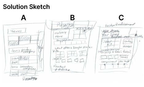
Screen A - The screen before the most critical gives the user preferences/filters to input their budget, get the style they want by theme, add a room picture for screen C and use small, medium and large items to gauge how much impact the décor would have on a room.
Screen B - Most critical screen. The actual shopping and selecting of items with advice and recommendations.
Screen C - “Build a room”. This page should bring all the main points together (Budget, assistance, final look from items chosen) giving the client positive reinforcement and confidence to follow through with their purchase. These screens show how we might give the user assistance in decorating their houses/apartments within a budget.
Wednesday
Deciding on the solution approach
I am realizing through the storyboard sketch how my original steps from the end to end storyboard may not need to all be separate pages. These can be simplified and combined to create less steps and easier functionality. Each of these processes allow insight to simplify the original ideas, providing a more aesthetically pleasing and user friendly product. Sketching is a quick methodical tool that shows how many steps are involved and a step to evaluate the more complicated screens and processes along the way.
Storyboard:
Showing the clicks taken to reach each step through screens A-C

Thursday
Bringing the ideas to life with a prototype
I am creating the prototype in “Marvel”, I read it was a very quick and easy prototyping tool. This is a change from my normal Figma prototypes. I wanted to see what an alternative program could offer. I do like the components and variables in Figma much better as it saves much more time to make any changes. I’m aware I’m on a learning curve with Marvel but I much prefer the Figma components and variables, the time for changes would decrease significantly.
Prototyping is another tool that helps evaluate the complexity of a solution. As you need to create each step, this process shows the ability in multiple areas to simplify.
I think the entire first screen could be listed in the “Filters” drop down only and I could eliminate that page entirely. This would not be a difficult change as the filter dropdown is already planned in the layout. I would only need to draft out the dropdown. Moving forward with the first round of testing including “Screen A” as it may be easier to understand the reactions, needs, and wants of the user’s preferences while the page is separated.

Friday
Validate the Idea
This is the day to put the solution to the test! I am conducting four moderated virtual usability tests. By testing a prototype that is very basic with little interaction I am noticing a flaw in my script. After the first test, I need to explain the prototype in more detail for the participant. This is to eliminate irrelevant frustrations that can hinder the outcome. The explanation is even more important in such a low-fidelity design test. The adjustment is made for the remaining tests. The change made to the script is very beneficial, as the participants are explaining more of the thought process instead of reacting. I’ve decided to start with one main task/question with each participant and use specific prompts for each of the three pages.
Setting up the Scenario:
You’ve recently moved into a new apartment near the beach. Use this website to bring style to your new home within a limit of $250 and gain confidence in your item choices.
Findings and reiterations from usability studies
Taking my notes from all 5 participants, I am segmenting them and inputting the statements into a spreadsheet. By coding and sorting the results pain points are starting to group together quantifying the challenges and successes in the design.
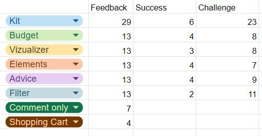
Overall feedback from moderated usability testing:
Overall the budget features are intuitive and very helpful. The visualization and advice provided insight and was thought to help their item choices. The shopping cart was what was expected with bonus budget features. The “kit” idea was liked but the layout design needed to showcase it more.
Top Outcome:
Hierarchy needs re-evaluation on Screen B. Users are unsure where to look or what to do first. The “Kit” is not concise and clear, after an explanation users thought the idea is cool. The layout confusion causes the kit idea to be lost and the CTA leads everyone to select check out before the user is ready to purchase. This would cause shopping cart abandonment, which is the reason we want to bring the user to screen C.
Recommendations
Re-organized and added hierarchy to screen B.
Removed the “Checkout” button on screen B, keeping it in the Cart.
Make the button “Add Kit to Cart” the CTA
Once Items are added to the cart have the CTA change to “View Room”.
The “Get Advice” button in the navigation bar does not match the final portrayal of screen C. The unexpected results caused confusion. The overall impression for screen C was positive with a few layout and elemental adjustments to be refined. Advice that is provided below the image section had very positive feedback. Here I noticed excitement in the users.
Change the “Get Advice” button to “View Room”
Add the room picture on Screen C instead of Screen A.

Conclusions
The GV design sprint successfully provided a possible solution for House2Home. By creating a budget focused ecommerce solution and providing a kit and suggestions to customers for items based on their themes the website provides solutions for both the company, stakeholders and user’s goals. The budget feature was a big hit to the users in testing. This process was very intriguing to learn how well a solution idea can be evaluated in just one week.
Design Sprint Process:
I have learned the significance of a design sprint and how it can quickly test a possible high end solution option without too much risk. In my next design sprint I will attempt to think of more expansive solution ideas. This is a great tool to test unique ideas. That is how you come up with a one of a kind product.
Product results:
My results prove this approach is a unique option with user intrigue. There are more insights that can be collected in this solution and much more refining to be made. Overall this approach has given me an interesting solution to the goals of the stakeholders and users.
What could be different?
I do wish I had the option for collaboration within a team, as I think ideas can grow from one another to make something even better, especially in these time constraints. I would have liked to see the solution options if more minds were involved.
I am interested to learn more about synthesizing my research results to come up with factual numbers to present. I see that I have not provided enough proof in that area.